本文主要介绍了html css3不拉伸图片显示效果,类似淘宝,具有一定的参考价值,感兴趣的小伙伴们可以参考一下
1.利用transform属性不拉伸显示图片,(路径问题需要按需求修改);
html:
|
1 2 3 |
|
CSS:
|
1 2 3 4 5 6 7 8 9 10 11 12 13 14 15 16 17 18 19 20 21 22 23 |
|
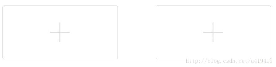

最终效果如上图的左边。
2.参考淘宝的,利用display:table-cell和文字大小控制居中
html:
|
1 2 3 4 5 |
|
css:
|
1 2 3 4 5 6 7 8 9 10 11 12 13 14 15 16 17 18 19 20 21 22 23 24 25 26 27 28 29 |
|
效果如上图中的左边部分,重点是需要外面的div是正方形。
淘宝的是这样的:
相关推荐
 manongba · 698浏览 · 2019-05-09 17:03:46
追忆似水年华 · 1373浏览 · 2019-05-09 22:47:56
追忆似水年华 · 999浏览 · 2019-06-03 10:39:21
manongba · 717浏览 · 2019-06-10 09:16:16
追忆似水年华 · 907浏览 · 2019-06-13 09:39:50
manongba · 698浏览 · 2019-05-09 17:03:46
追忆似水年华 · 1373浏览 · 2019-05-09 22:47:56
追忆似水年华 · 999浏览 · 2019-06-03 10:39:21
manongba · 717浏览 · 2019-06-10 09:16:16
追忆似水年华 · 907浏览 · 2019-06-13 09:39:50


0评论